Web Ad Manager Branding
From Dot2DotCommunications
Revision as of 09:34, 1 December 2016 by Ivan.belenski (Talk | contribs)
Contents |
Branding the Public Application
This is the application that provides the online sharing features: location list, POP.
You need to provide us with:
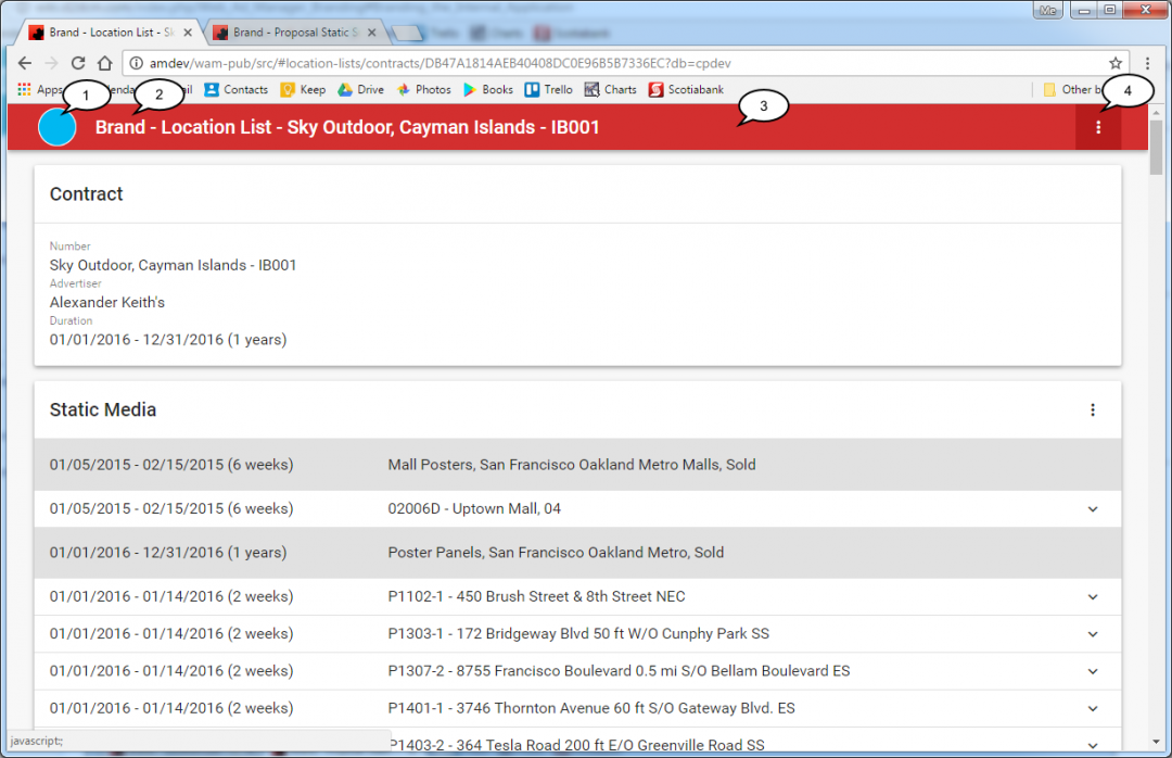
- a logo .png file; it doesn't necessarily have to be square; it will be shrunk to a height of 40 pixels, preserving its aspect ratio; (1)
- a single word or abbreviation to replace the word "Brand" in the title bar; (2)
- a color palette:
- a primary color (for the title bar); (3)
- a darker hue of the primary color; (4)
- optionally, a 16x16 .png, .gif, or .ico to serve as a shortcut icon.
Branding the Internal Application
This is the application that requires a user login and provides features for internal use: proposal entry, etc.
You need to provide us with:
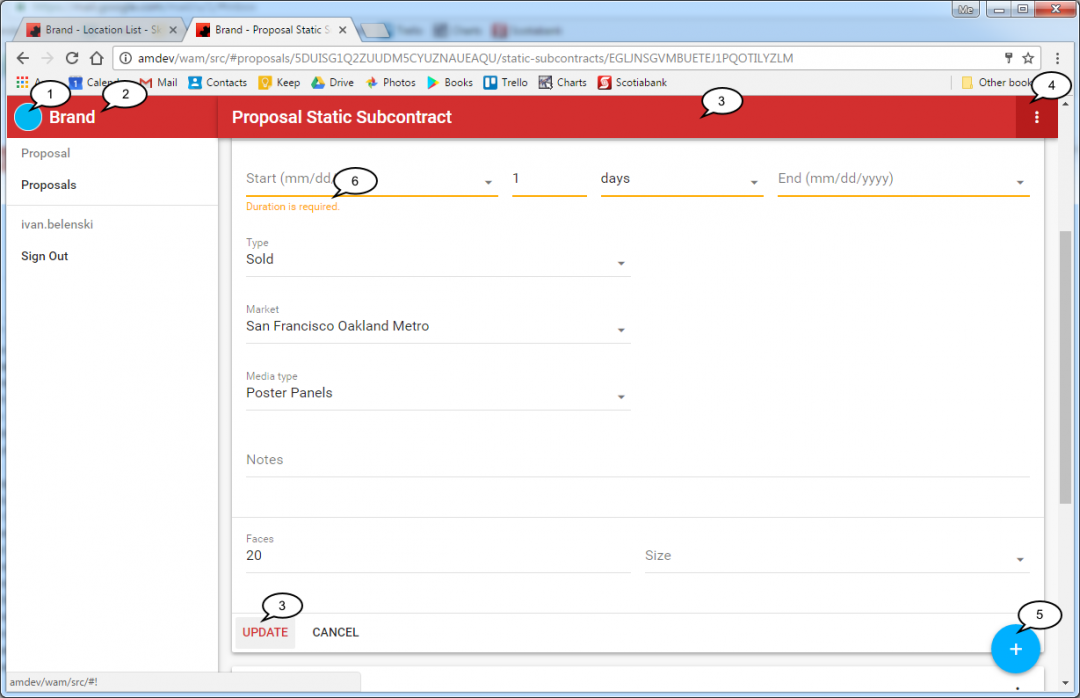
- a logo .png file; it must be square; it will be shrunk to a size of 40x40 pixels; (1)
- a single word or abbreviation to replace the word "Brand" in the title bar; (2)
- a color palette:
- a primary color (for the title bar, the inputs that have the keyboard focus, and the primary action buttons); (3)
- a lighter hue of the primary color;
- a darker hue of the primary color; (4)
- an accent color (for the floating action buttons); (5)
- an "error" color (to be used to highlight erroneous input); (6)
- optionally, a 16x16 .png, .gif, or .ico to serve as a shortcut icon.
Color Palette
We recommend selecting colors from the Google material design palette.
The unbranded apps are using the following colors:
- primary: Red 700
- light primary: Red 500
- dark primary: Red 900
- accent: Light Blue A400
- error: Amber A700

